___
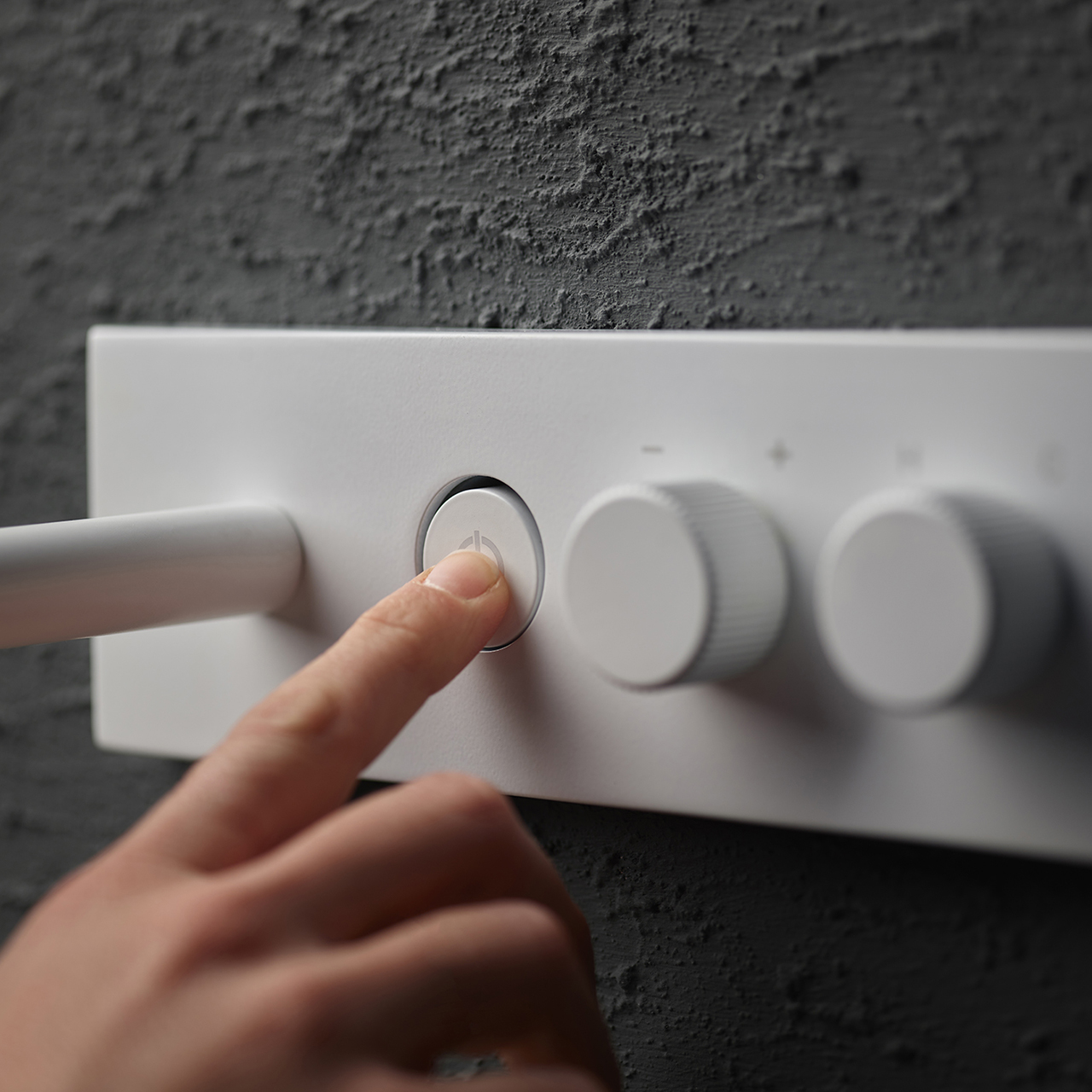
Starting from the principles of ergonomics and expanding the focus to the user experience is a natural step in FIMA’s design approach.
It is part of the broad vision we have when we develop a new collection and immediately imagine it in relation to the user.
The goal is to establish an immediate connection between the user and the product, through ease of use and learning how to use, and amplification of the positive feelings that derive from it, thanks to its performance and the pleasure of the experience itself.
Therefore, an anthropometric and functional design approach is simply not enough, even though we deal with these aspects in ensuring the health and safety of the products.
We have to go further. We have to develop a more complex process that combines technical competence with a design sensitivity capable of interpreting the needs of the market, increasingly influenced by digital tools that modify ways of relating to surrounding products.
Underlining some of these aspects in the latest collections in the catalogue, therefore, seems to us an interesting way to speak of design details that, though they may be less evident, are an important added value in choosing FIMA.
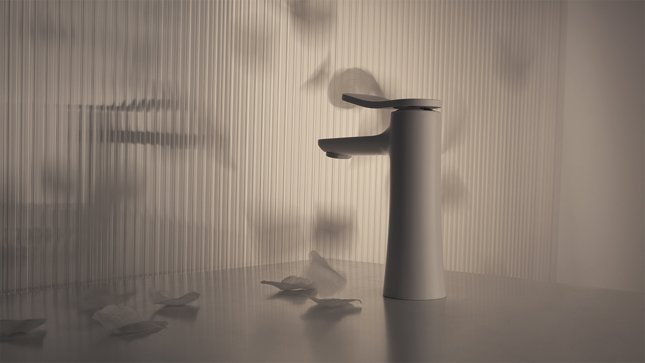
FLO’ is the new FIMA proposal debuted at the Milan Supersalone furniture fair, which immediately met with the market’s favour (we talk about it here). The focus was on a light, elegant collection, simple to use, versatile in terms of its setting and installation, because it was also intended for contract projects. Starting with this brief, the FIMA technical division was able to articulate FLO’ in a series of inspired choices in terms of experience and ease of use.
Behind the soft and sinuous lines of the mixer hides one particular choice referring to product maintenance and installation. Eliminating sharp edges and areas where limescale can build up allows for easier and quicker cleaning, which is extremely important in the contract and hotel sector. The downwards tapering body widens the support base of the tap, avoiding the need for rings or bases, which are more difficult to install. Finally, the raised position of the cartridge prevents the infiltration of water, guaranteeing longer-lasting perfect product performance.
Investing in and thinking about practical aspects, not only related to water delivery, is a constant in FIMA’s design approach. However, in terms of ergonomics and user experience, aesthetic choices are also strongly connected to the well-being and desirability of products.
In FLO’, connections between surfaces and the balance of proportions are fundamental in defining the visual appeal of the collection. FIMA chooses to focus on absolute cleanliness of lines, totally eliminating mechanical details such as pins or holes from view, and proposing an exclusively pop-up plug system. The result is an aesthetically beautiful fitting from every point of view, easy to approach and to use in interior design projects, because it is also so adaptable to non-standard installations.
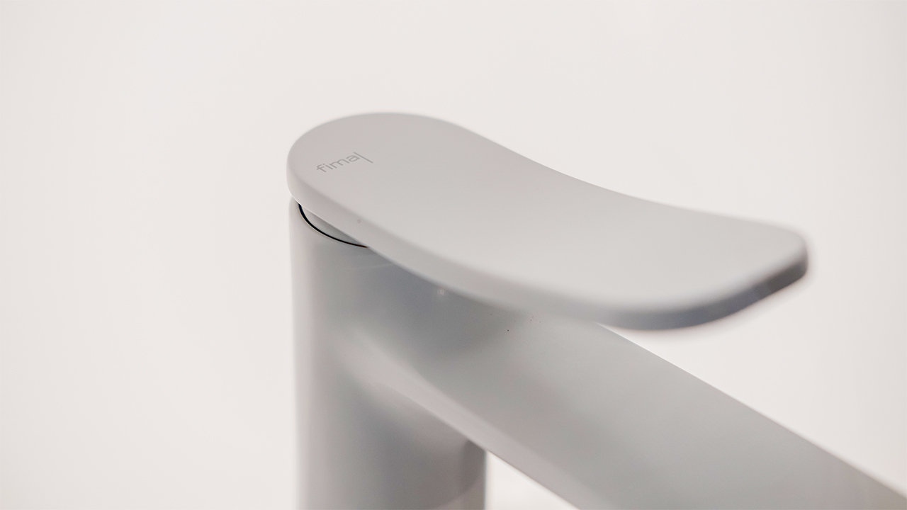
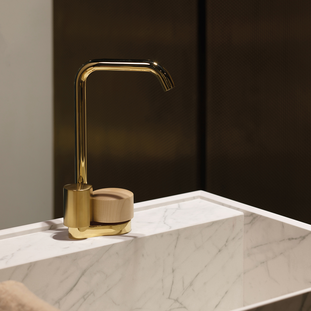
Regarding the user interface, a further plus point of the FLO’ collection is how it invites the user to use it. There’s immediately an invitation there for you to open the tap, because the gesture is so pleasant, due not only to the size and length of the lever, which facilitate an easy grip, but also to the special mechanism that allows the lever to slide gracefully forwards.
Gestures are the basis of Davide Vercelli’s design thinking for the SWITCH collection and its sister collection SWITCH ON. Engagement with a product relies on an acquired habit or understanding how to operate it in an entirely intuitive way, perhaps by using a similar gesture used in another daily action.
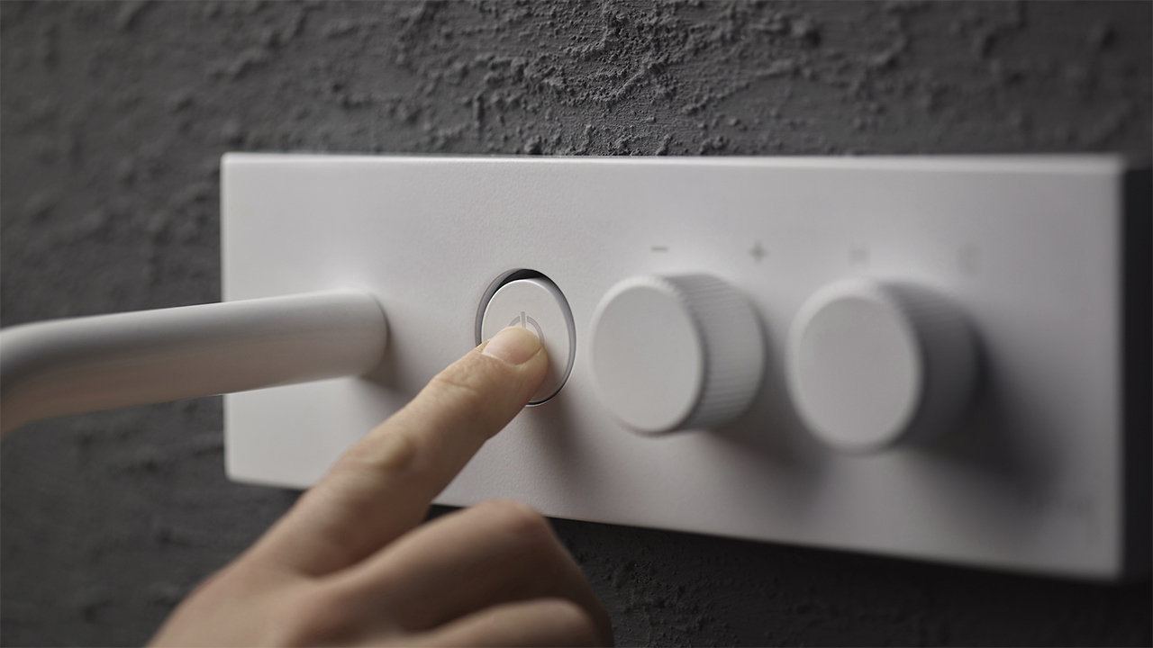
This is the case with SWITCH, where a button starts and stops the flow of water just like any on-off switch in an electrical system or on an appliance. Faced with an innovative object that might otherwise be confusing from a formal perspective, using of an already acquired and internalized gesture immediately makes the product accessible and even intriguing, encouraging the user to interact with it.
The SWITCH interface is not the only aspect directly related to the user experience. The same reflection extends to the entire system by offering many composition and distribution options. From a design point of view, these options are there to be leveraged with careful installation, to meet the actual needs or desires of the user. A key aspect that affects the well-being and pleasantness of the experience and creates a positive and lasting bond with the product
Lastly, the development of a slimmer, flush body allows the product to be light and compact, easy to handle, and visually non-invasive. This is extremely important, especially in the case of the sister collection SWITCH ON, as it extends from a shower system to the whole bathroom.
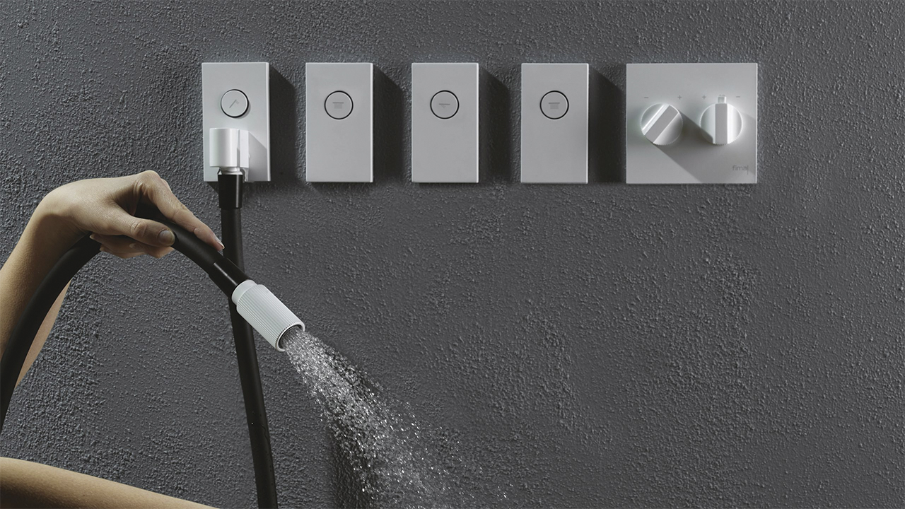
SWITCH ON comes in 4 versions, with a basin mixer, bidet, and built-in bath and shower fittings. Incorporating the spout or hand shower into a single plate, and separating the controls for on-off, temperature and flow, demanded a careful ergonomic study of the product, and is a fine example of a well-solved design challenge.
At the heart of every mixer is concept of adjustment, that is, finding just the right mix of temperature and flow that subjectively satisfies the desire of the user. Designing to make this mixing easier, more precise and more reliable means dealing with well-being and usability, and, therefore, indirectly concerns both ergonomics and user experience.
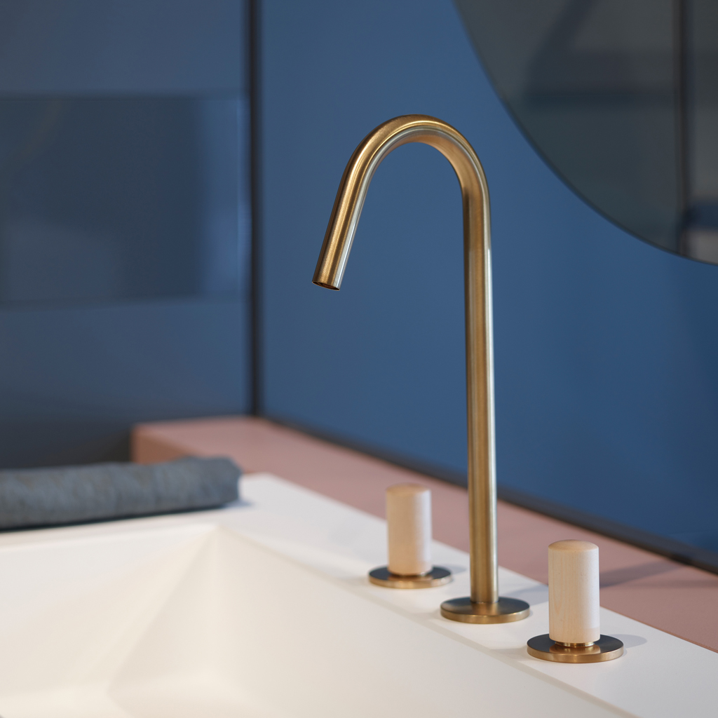
This is where SO takes the stand. The innovative mixing idea developed by Davide Vercelli clearly separates the temperature from the flow rate, making these variables totally independent from each other. The greater the control, the better the comfort offered by the product. Supporting well-being are also a series of aesthetic and material choices that help the user relate more easily and immediately with SO. The two controls have different shapes and sizes, offering a wider easily gripped cylinder for adjusting the flow rate, and a taller, slimmer control for precisely adjusting the temperature.
With the cylinder sectioned on one-side, the straight edge allows you to judge the water temperature with a simple glance, so that you can leave it in the same position. To make the different functionalities of the two knobs even clearer, FIMA proposes a combination of different materials such as concrete and wood, as alternatives to the more classic galvanic or chrome finishes. This not only increases the possibilities for customizing the product, but also enriches the interface, making it immediately more user-friendly.
Learn more:
About SWITCH >> download SWITCH MAGAZINE
About SO >> download SO MAGAZINE