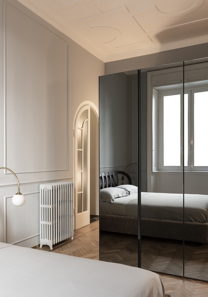
- КОЛЛЕКЦИИ
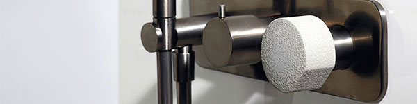
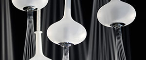
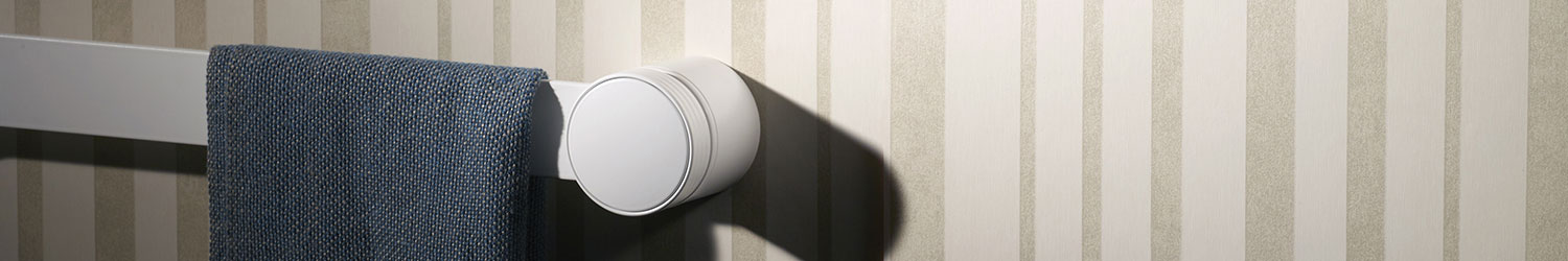
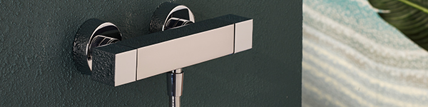
SNAP
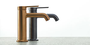
Характерная черта, смелые объемы, с тщательно пропорциональными радиусами, которые ласкают продукт, создавая баланс между классическими цилиндрическими формами и современными линиями.
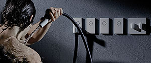
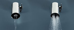
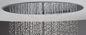
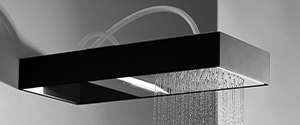
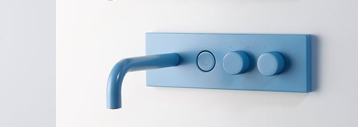
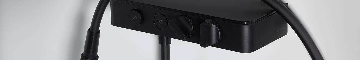
SWITCH ON
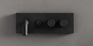
SWITCH ON - серия, родившаяся из желания дополнить и расширить душевую систему SWITCH, главным плюсом которой является управление потоками воды на самом выходе простым нажатием круглой кнопки.

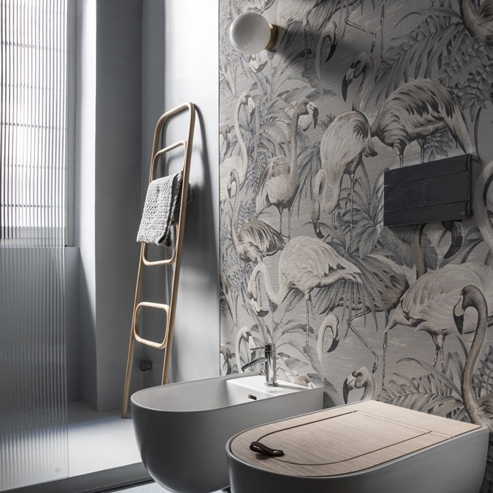
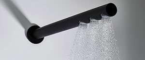
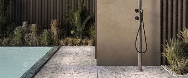
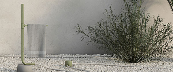
OUTDOOR
Пространства Outdoor являются драгоценными "оазисами" для нашего отдыха. Именно для того, чтобы использовать их наилучшим образом, и родилось подразделение Fima Outdoor, которое с помощью функционального и эстетически привлекательного дизайна создавет новые ритмы и беспрецедентные ритуалы хорошего самочувствия .
- ВАННОЙ КОМНАТЫ
- WELLNESS
- OUTDOOR
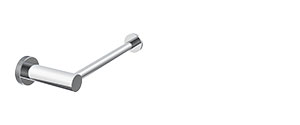
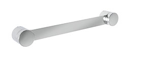
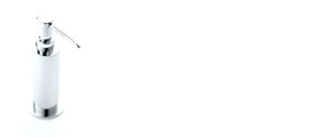
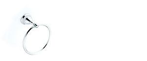
- АКСЕССУАРЫ
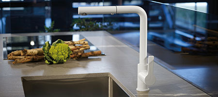
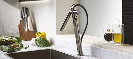
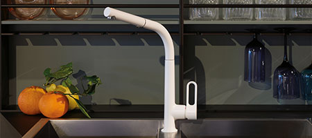
- KITCHEN
- ТЕРМОСТАТИКА


- Collezioni
SNAP
Carattere evidente, volumi importanti, tante raggiature accuratamente proporzionate per accarezzare il prodotto, lasciandolo in equilibrio tra forme cilindriche classiche e linee moderne.
SWITCH ON
SWITCH ON, una serie nata dalla volontà di completare e ampliare il sistema doccia SWITCH, il cui principale plus è di “azionare” con la semplice pressione di un tasto a sfioro rotondo i flussi di acqua in corrispondenza dell'uscita stessa.
OUTDOOR
Gli spazi outdoor sono oasi preziose e rappresentano una grande risorsa per il nostro relax: per viverli al meglio nasce la divisione Fima Outdoor che crea nuovi ritmi e inediti rituali di benessere attraverso un linguaggio progettuale funzionale ed esteticamente accattivante.
- Bagno
- Wellness
- Outdoor
- Kitchen
- Accessori
- Termostatici